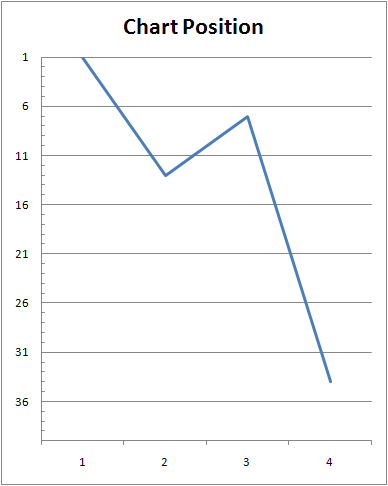
I had an unusual query this week. A member of staff wanted to create a line graph that showed the chart position of a song over a number of weeks.¬¨‚Ć It’s an easy thing to do – two columns in the spreadsheet, one for “Week” and one for “Position”.
Problem is, in a chart, the low numbers are at the top and the high numbers are at the bottom, so the graph comes out upside-down. You can’t just make the chart position numbers negative either, as the x-axis would then be on the top of the graph.
Thankfully, there’s still an option: right click the y-axis on the graph and choose “Format Axis”. Tick the boxes for “Values in reverse order” and “Maximum axis value”. While you’re here, you might want to change the Minimum value to 1 from 0, as there’s no 0 position in your average pop charts!
See:
You can also download the Excel file, if you like.

